Choosing gemstone colour in the light you actually use
Choosing gemstone colour in the light you actually use.
In this article
How will the colour look where you plan to wear the jewellery? Start your comparison with that place. A pendant for office wear and a ring for evening occasions may deserve different viewing sessions. The aim is to discover what you enjoy seeing, rather than make one photograph the final judge.
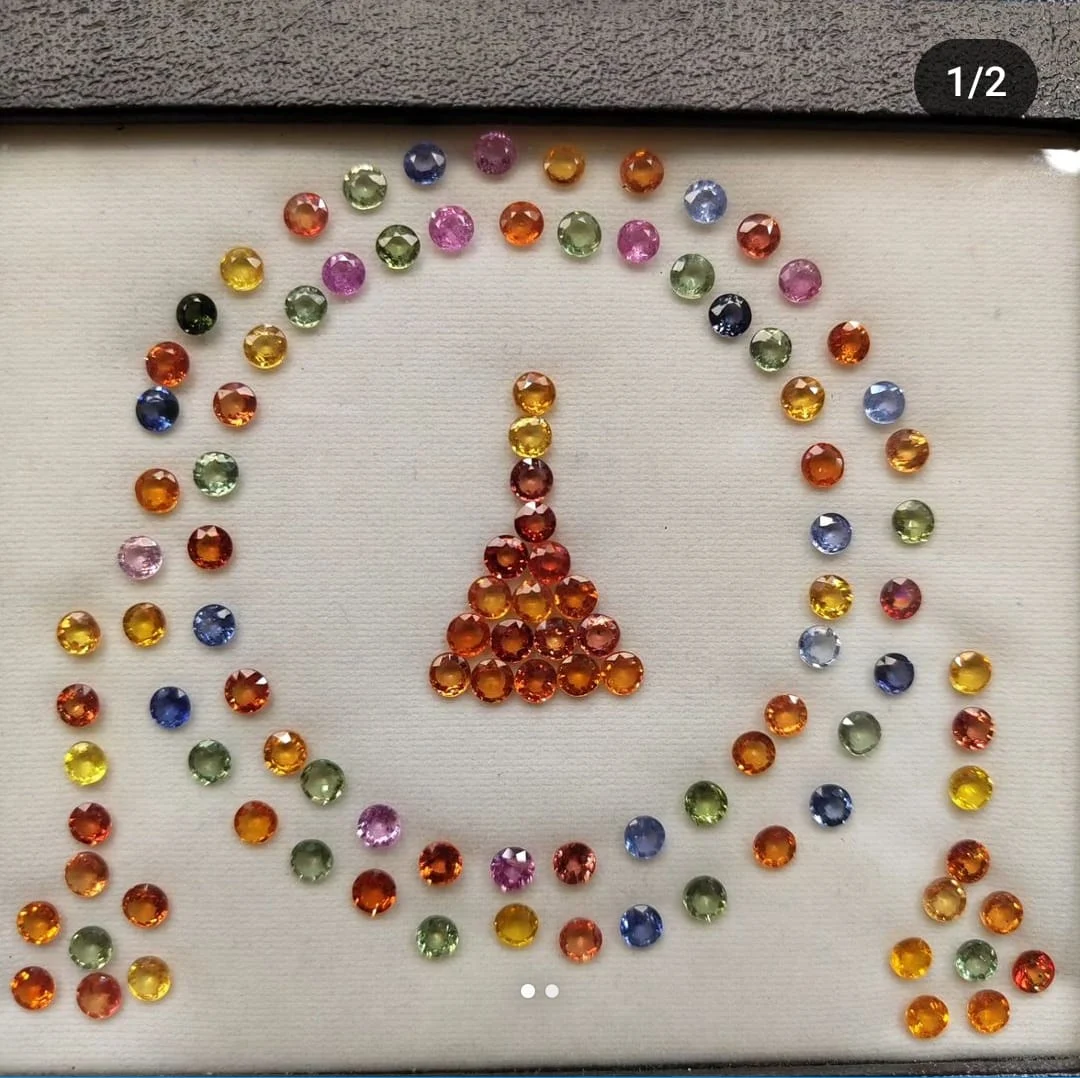
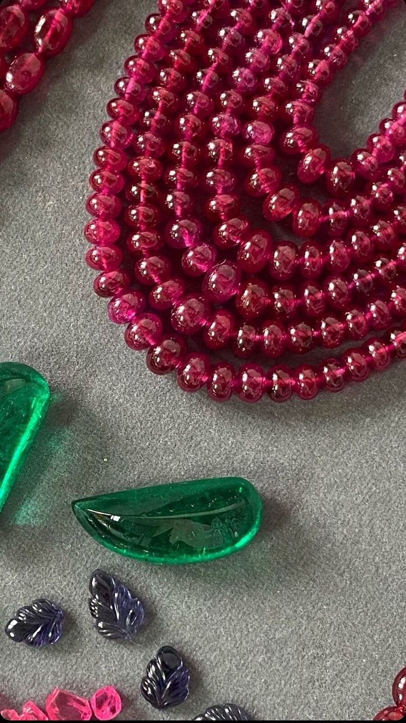
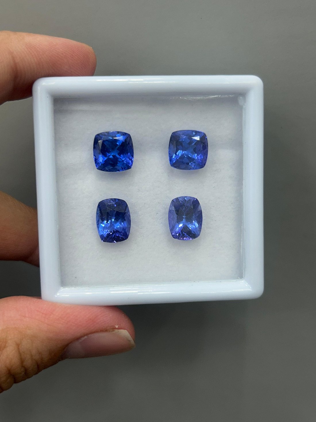
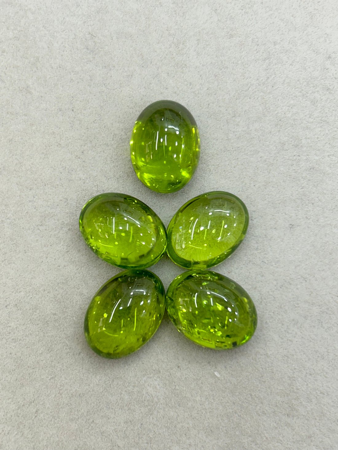
Gem colour is often discussed using hue, tone and saturation. Hue identifies the colour family; tone describes lightness or darkness; saturation describes intensity. Lotus Gemology also explains that lighting affects appearance and that colour names cover ranges. Screens cannot reproduce every visible colour. A named shade therefore deserves explanation and direct viewing where possible. Lotus colour guidance


Describe what you actually see
Replace “better blue” with a few plain observations: lighter or darker, leaning towards green or violet, lively or subdued. You do not need to assign a laboratory grade. These descriptions are a practical way to communicate your preference and avoid talking past a seller.
For a first comparison, use the same surroundings for both candidates. Make a short note without looking at their descriptions. Then read the descriptions and see whether the words explain your experience. If a term feels vague, ask what the seller means by it.
Try a small viewing diary
Imagine you are comparing two stones for a pendant. In your first session, you prefer one immediately. Put that reaction in writing. In a second session, ask yourself whether you would still choose it for the outfit and occasion you have in mind. Use the diary to notice your own preferences. It is not a scientific colour test.
For a saree outfit, the saree jewellery guide adds a practical comparison of the blouse, drape and pieces together.
A simple diary might contain three entries:
- “My first impression, without the sales description”
- “The lighting and viewing distance used”
- “What I still want to ask before choosing”
Where in-person viewing is unavailable, request a clear description of the lighting used in the listing. Read what online photos can leave unanswered before comparing images produced by different sellers.
Ask about the name on the label
Trade colour descriptions can be useful conversation starters. Ask whether the label is the seller’s description or a named finding on a particular laboratory report. If it appears on a report, ask which laboratory issued it and what the report actually says. You can explore this in our laboratory-report guide.
Then return to the stone you will wear. You may prefer a quiet colour even if the description celebrates intensity. You may care more about how two stones look together than whether either meets a trade label. Those are choices to make openly, without pretending they are universal rules.
For material-specific questions, the sapphire guide and tourmaline guide are useful next steps. Colour is one part of the purchase; gemstone quality questions bring the other parts back into view.